Urban Outfitters
THE CHALLENGE
How can we create several distinct design indentities within a single brand, while maintaining a common aesthetic thread?
THE BRIEF
This is a series of independently designed concepts for the clothing retailer, Urban Outfitters. This project was an exploration of various styles and ideas for marketing and rollout.
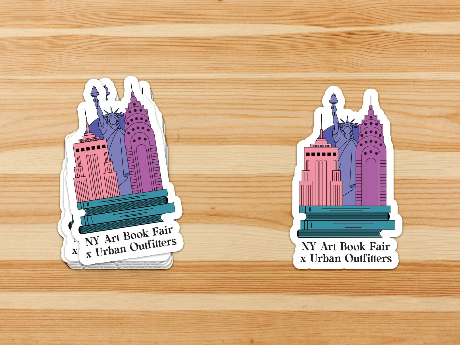
The project includes designs for a NY/LA Art Book Fair x Urban Outfitters crossover event, spring season in-store promotional signage, clothing tags for the Urban Renewal brand, and packaging celebrating the brand's 50th anniversary.
THE SOLUTION
The illustration-based posters serve as a playful way to showcase the unique landscapes and landmarks of each location. This idea could be easily expanded to include additional locations. This key art could then be expanded to various pieces of rollout like tote bags and sticker sets.

The spring sale signage uses a warm and vibrant color palette and abstract floral shapes to celebrate the new spring season without being too on-the-nose.

The tag set for the Urban Renewal arm of the business, is designed to imbue customers with a sense of pride every time they purchase rare, one-of-a-kind items.

Finally, the packaging set is a call out to UO's early 70s roots and celebrates the brand's history as a top trendsetter in the streetwear market.