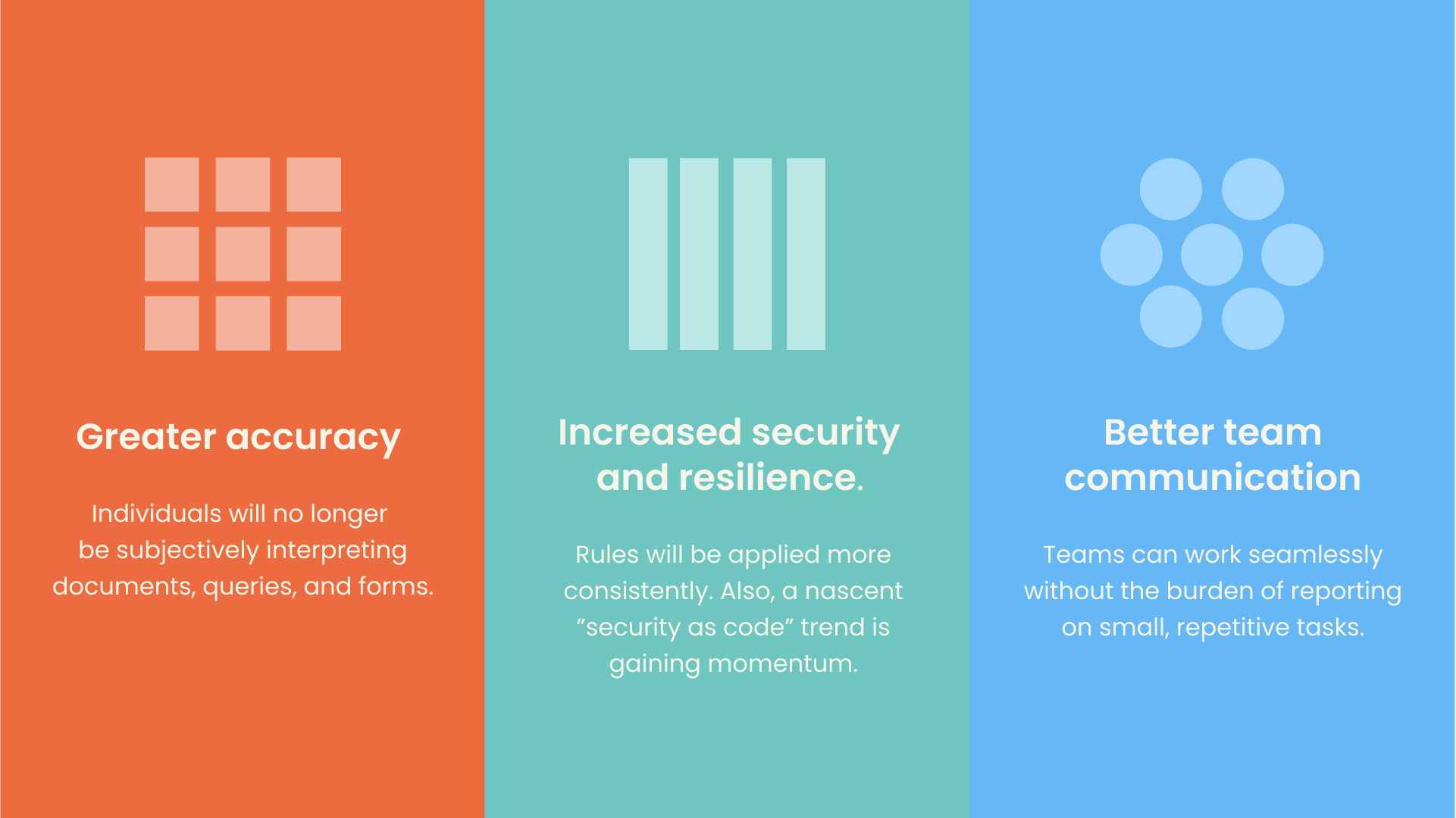
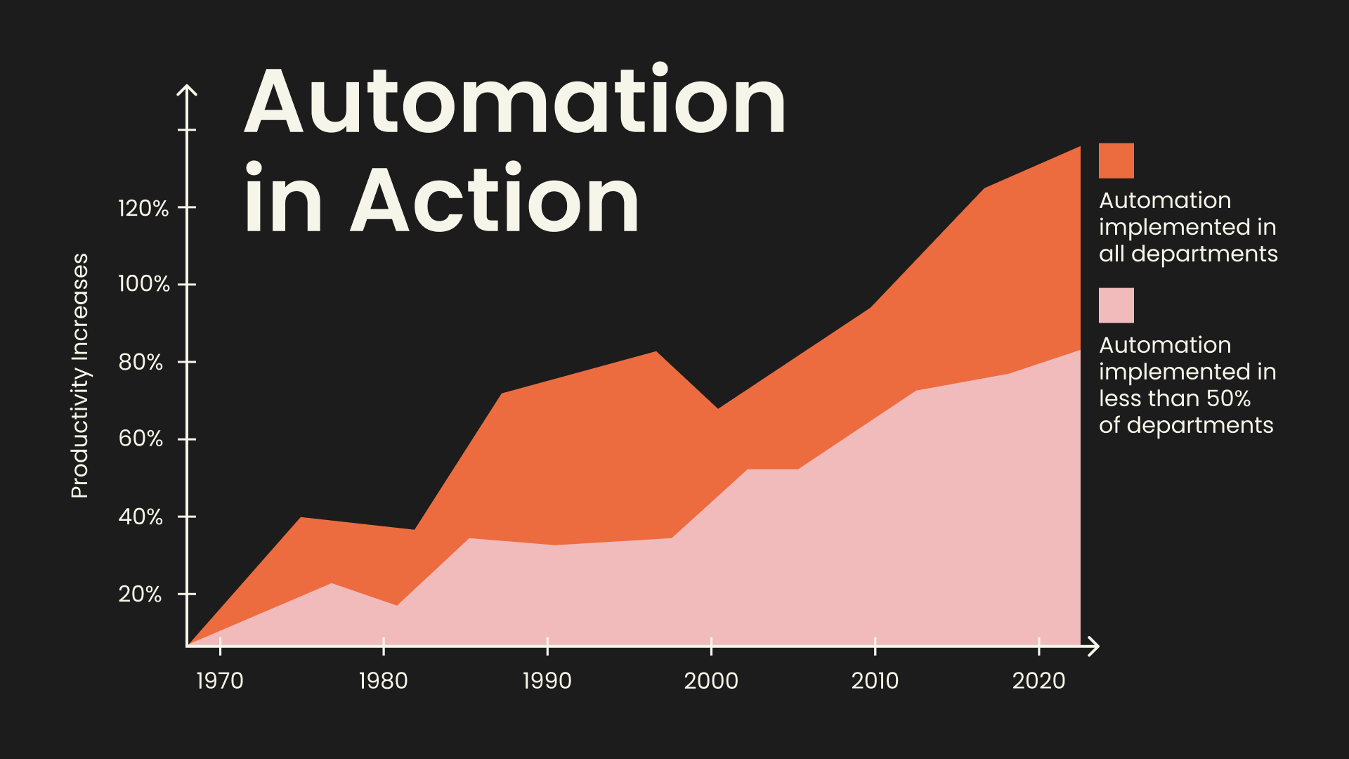
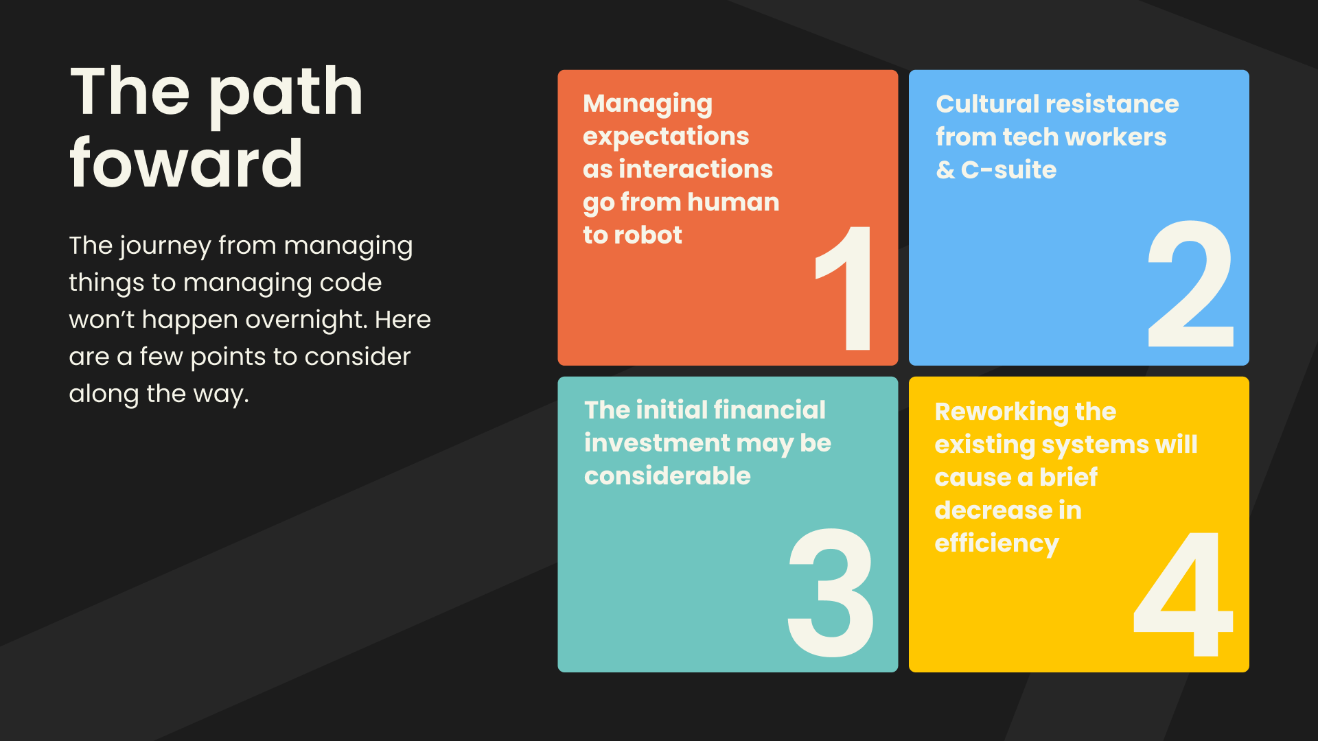
THE SOLUTION
After extracting major data points and distilling them into digestible takeaways, I employed a bold, high-contrast color palette for emphasis and viewer engagement. Simple shapes served as both a fun branding device and a graphic language. Striking divider slides present thought-provoking questions, allowing for contemplation and relaxed pacing. The data visualization design centered on simplifying the visuals with color, grouping, and simple shapes. The result is a cohesive and engaging report that effectively communicates the content of the report.